At the beginning of this year, I spoke about understanding colour more carefully, taking the time to look at undertone, to consider finish, and to notice how light moves across a surface. That process mattered because without it, colour remains instinctive rather than informed.
There is, however, a natural point where that understanding needs to move beyond observation and become something more practical. What we are seeing now is a shift in how people are approaching colour, and it is a meaningful one. The question is no longer whether something might work, but whether it is the right choice for a particular surface, and that distinction changes how a space comes together.
How to Choose Colour with Confidence
Choosing colour with confidence is rarely about finding something new. In practice, it is about selecting something that will hold across a room, not just in isolation, but across different surfaces, in changing light, and over time.
When a colour has been chosen well, it begins to settle into the space in a way that feels calm and resolved. Rather than appearing in isolated moments, it carries more naturally, allowing the room to feel cohesive rather than arranged. This is where decision-making replaces hesitation, and where colour starts to feel dependable rather than experimental.
Colour in Continuity
As that clarity develops, colour begins to move differently within a space. A cabinet starts to hold the wall rather than sit against it, a door and its surrounding panel read as a single surface, and furniture feels integrated rather than added afterwards.
Using colour across a room in this way is not about creating impact, but about creating continuity. The repetition is subtle, but it allows the space to feel grounded and considered, with each element contributing to a consistent whole rather than competing for attention.
Over time, this is what allows colour to shift from decoration into something more structural, where it becomes part of how the room works rather than something applied to it. What begins as a visual decision becomes something more consistent over time, where colour continues to hold its place as the space is used and lived in.
What Colour Confidence Means in Practice
There is often an assumption that colour confidence is about boldness, but in practice, it tends to be much quieter than that. It comes from knowing that a colour will behave well, that it will hold in different light, and that it can be used again without needing contrast or variation to justify it.
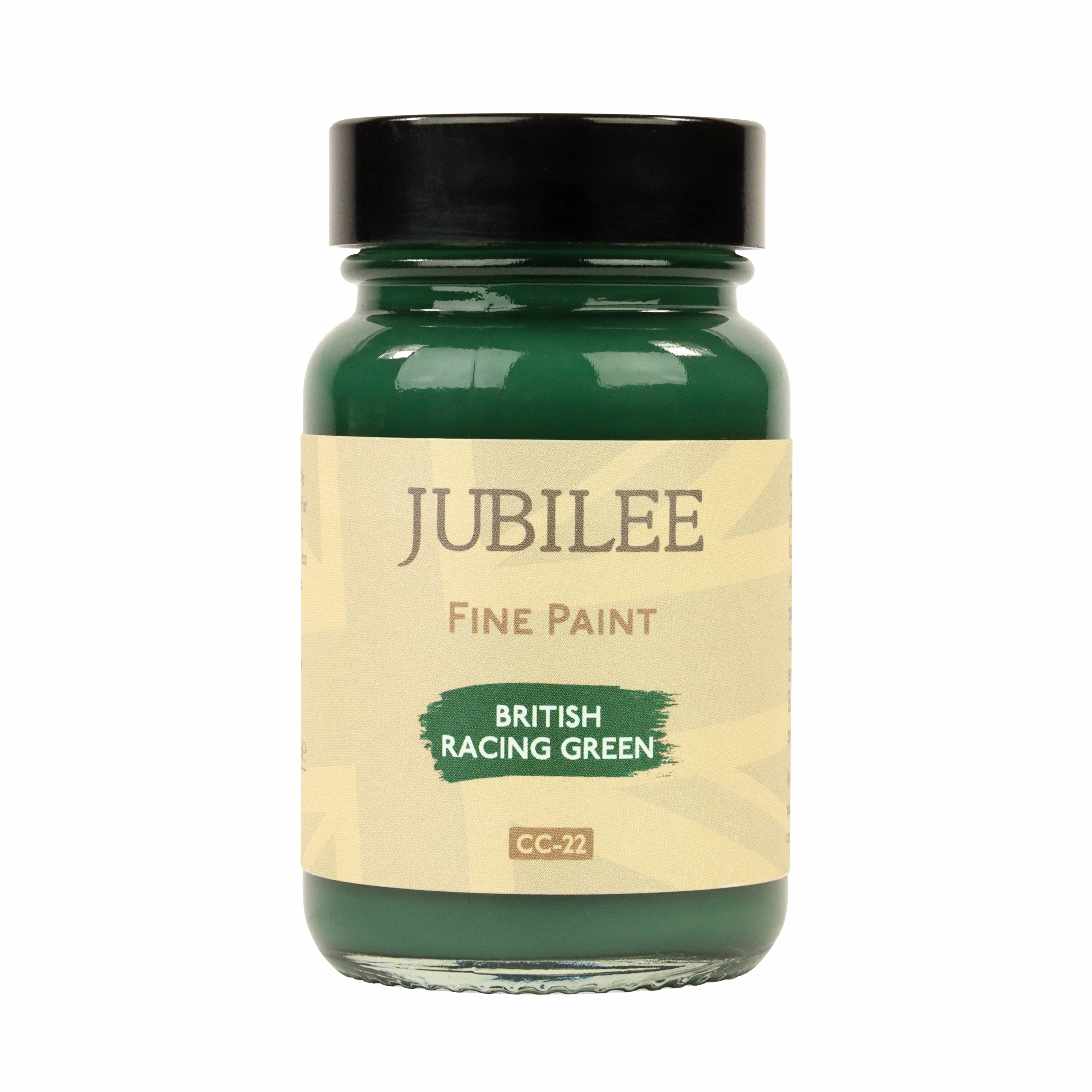
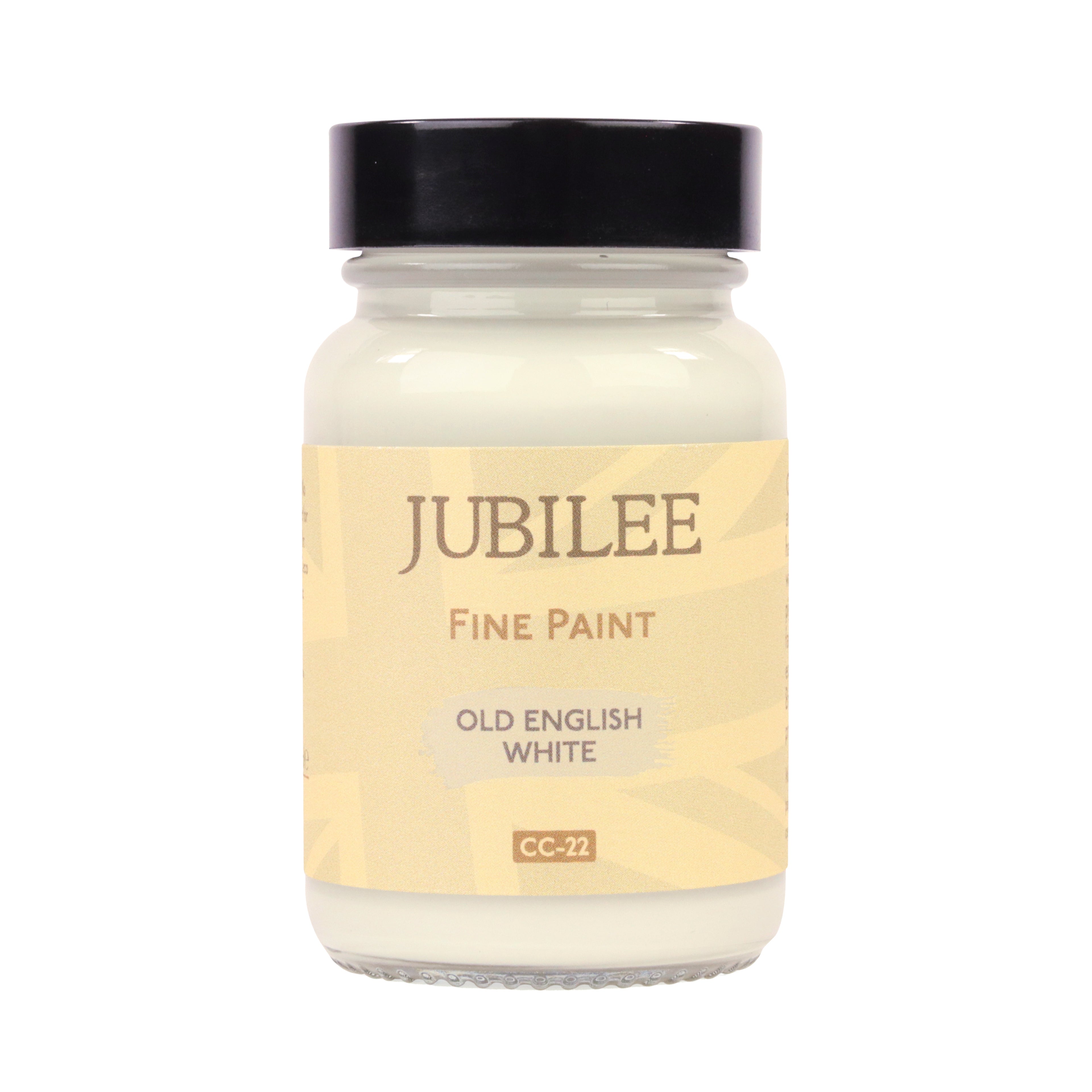
At Guild Lane, this thinking shapes how the collections are used together. Jubilee sits at the centre, not as a backdrop, but as the surface itself, with earth-led greens, softened browns, mineral greys and blue-greens that can carry across larger areas without becoming tiring.
Alongside this, GILD and Super GILD are used with more rhythm than restraint, with metallics carried quietly through edges and details so that they reinforce the overall scheme rather than interrupt it. BLEO extends this further by introducing tactility through fabric and porous surfaces, softening the composition and allowing colour to move naturally between materials.
Taken together, these are not separate decisions, but part of a consistent system.
Choosing with Clarity, Living with Confidence
As this way of working becomes more natural, the need for inspiration begins to fall away slightly, and clarity becomes more valuable. Making a decision and being able to rely on it over time is ultimately more useful than having a wide range of options that lead to uncertainty.
This thinking sits behind the tools we have developed, including the Colour Picker and Colour Wheel, which are designed to support more precise and confident choices. They are not there to expand possibilities unnecessarily, but to help you understand how colours relate to one another so that, once chosen, they can be trusted.
The most effective use of colour is rarely the most immediate or attention-seeking. It is the one that is used again, carried across surfaces, and allowed to settle into a space over time.
When this happens, colour begins to feel less like a decorative decision and more like an integral part of the environment. Its strength comes from consistency and familiarity, and from the quiet confidence of something that has been chosen well and allowed to remain.
Blogs we think you'll love
Outdoor Durability Of Jubilee Furniture Paint
British weather is charmingly unpredictable and hard on wood. Garden furniture endures rain, sun, frost and more. Without proper protection, wood fades, dries out and can warp. That's why a UV-stable, high-pigment paint like Jubilee is essential.
A breathtakingly immersive space, reminiscent of Parisian grandeur and theatrical elegance. The interplay of light, shadow, and metallic sheen adds movement and depth, making the room feel both expansive and dramatic—the perfect setting for a luxurious home cinema experience.
This season, we’re exploring how paint behaves as a material, not just as colour. What we call Grounded Expression that is rooted in stillness and substance. It’s a way of thinking about colour that prioritises sensibility over statement, craft over decoration, and depth over excess.