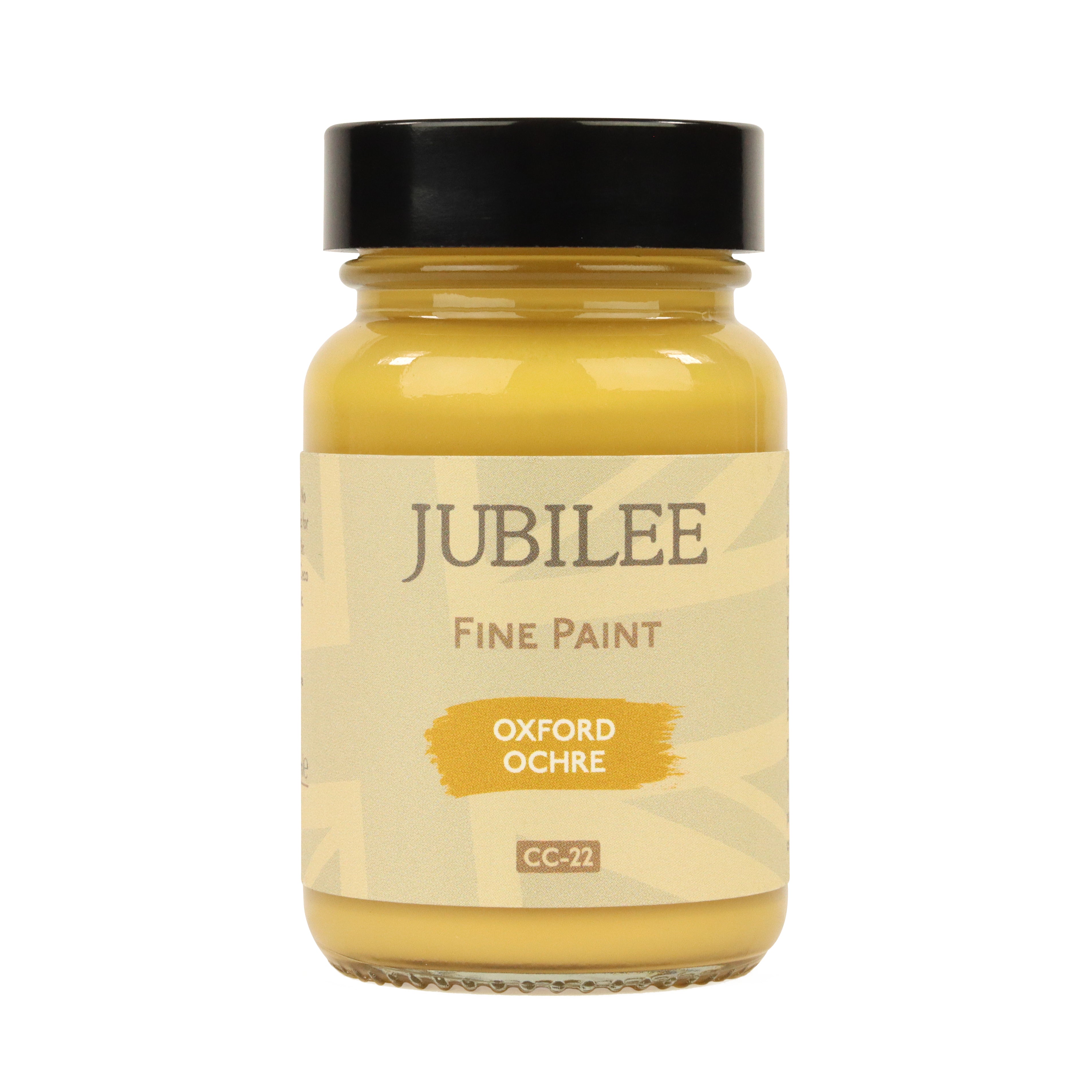
Using Colour With Intention: Oxford Ochre
Using colour with intention means choosing shades for how they live in a space, not simply how they appear on a paint chart. It is the difference between adding colour for effect and selecting a finish with purpose, confidence and longevity. This Oxford Ochre furniture makeover captures that idea beautifully.
More than a painted chest of drawers, this piece shows how thoughtful furniture paint colours can shape the atmosphere of a room or space. The warmth of the ochre responds to the cool stone wall, while vivid blue planters bring clarity and contrast. Surrounding greenery softens the palette and adds movement, while surface texture introduces age, tactility and a touch of character.

Nothing feels accidental. Colour alone is rarely enough. What matters is how it behaves beside the tones, materials and finishes already in the room. Every element works together, creating a result that feels calm, resolved and entirely at home.
Why Oxford Ochre Works as a Furniture Paint Colour
Oxford Ochre has the richness of natural earth pigment, giving it greater depth than brighter yellows or flatter modern tones. It feels grounded, heritage-led, offering depth without the sharpness of brighter yellows.
As part of one of the oldest colour families used in decoration, ochre tones have appeared in interiors for centuries, valued for their warmth, stability and enduring character. That history gives colours like Oxford Ochre a sense of familiarity and permanence that many trend-led shades never achieve.

That makes it an exceptional furniture paint colour for those who want warmth without overwhelm. It brings presence to a room while remaining easy to live with over time.
On this chest of drawers, Oxford Ochre transforms a practical piece into something decorative and characterful. It feels bold, yet balanced. Distinctive, yet timeless. That is why ochre-toned furniture continues to feel so relevant in both classic and contemporary homes.
How Surface Texture Brings Painted Furniture to Life
Colour alone would not create the same impact here. Texture and imperfection are equally important.
The drawer fronts hold decorative detail, softened edges and traces of the piece’s previous life. As light moves across the surface, Oxford Ochre settles into recesses and catches raised areas differently, creating depth throughout the day.
This is what gives textured painted furniture its appeal. A finish with variation feels lived-in, tactile, crafted and layered in a way that flat surfaces rarely can.

For anyone exploring furniture texture ideas or painted furniture ideas, this is a reminder that character is often something to preserve, not removed.
An Upcycled Furniture Makeover with History Still Visible
This upcycled chest of drawers had lived through many previous finishes before arriving at its final colour. Beneath the Oxford Ochre sat a whole spectrum of earlier layers, each one part of the piece’s story. It had been used as a paintbrush off-load, an idea board and a general utility piece.

Rather than erase that history entirely, parts of the surface were carefully sanded back to reveal glimpses of those earlier colours and mishaps. That choice was intentional. It gives the final finish depth, expression and honesty, showing how multiple tones can still work beautifully together when balanced with care.
The result is more interesting than a flat repaint. It carries movement, character and a sense of lived-in vintage charm.

For anyone looking for upcycled furniture ideas or a colourful furniture makeover, this approach shows that restoration does not always mean starting again. Sometimes it means editing what is already there.
How Oxford Ochre Can Warm and Balance a Space
Paint is more than a finish. It is a tool for changing how a space feels.
Oxford Ochre can be used to bring warmth to spaces led by cooler tones such as blue, stone grey or soft mineral neutrals. In those settings, it introduces balance and depth without disturbing the calmness of the scheme.
Used on furniture, cabinetry or smaller surfaces, it can create a point of focus, soften harder architectural elements or add a sense of welcome where a room feels too stark. Paired with natural materials and layered texture, it brings character while still feeling settled and considered.
This is the value of intentional colour. It is not chosen simply to be seen, but for what it brings to the room around it.
Shop These Hues
Jubilee Fine Furniture Paint is designed to apply cleanly and build colour evenly, allowing deeper tones such as Oxford Ochre to develop without becoming heavy. As an all-in-one formulation with a built-in topcoat, Jubilee delivers a smooth, durable finish while maintaining clarity of colour.

Why Intentional Colour Choices Last Longer
Some colours capture attention for a moment. Others continue to reward you long after the painting is finished.
Oxford Ochre belongs to the second group. Its warmth, depth and earth-based character give it a sense of permanence that trend-led colours often lack. It can evolve with changing rooms, shifting seasons and different surroundings while still feeling relevant.
That is the real value of choosing colour with intention. It is not only about how a piece looks today, but how it continues to live with you over time.
Some colours simply decorate a surface. Others change how a home feels. Oxford Ochre belongs to the second kind, a colour that continues to shape a space long after it has been applied.
Shop This Look
Oxford Ochre is part of Guild Lane’s heritage-inspired palette, created for homes that value warmth, character and considered colour.